Think back to a time when you sat through an attention-grabbing presentation. Whether it took place at school or work, what stood out to you?
We’ve all had to sit through the boring ones—slide after slide, with too many bullet points and too little creative design strategy.
So the next time you have to prepare a presentation, why not set the standard for excellence?
Read on for creative design tips and tricks to help you think outside the box—so you can wow your audience with your next presentation!
Five Creative Design Tips and Tricks to Crush Your Next Presentation
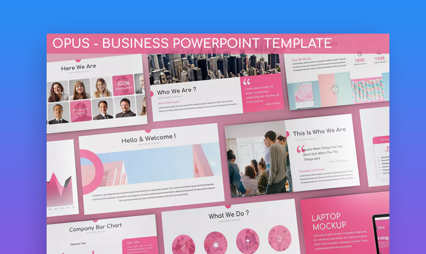
Avoid using stock templates
Sure, it’s easy to select from the stock templates that your presentation software provides, and it may even save you time in the long run. We’re all guilty of using them. But what unique quality do stock slides and templates provide for your presentation? Your audience may end up thinking that you put very little effort into the presentation that they’re spending their valuable time watching.
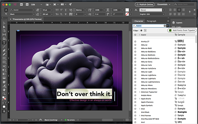
Our Jennasis Pro Tip: Use a program like Adobe InDesign or Adobe Illustrator to create custom slide templates. You’ll have more creative design freedom and will be able to include specific elements such as brand colors, logos, and fonts.
On the flip side, avoid using stock images. If you’ve sat through enough presentations, you can probably instantly spot a stock image. These are licensed photos that you can download for free (or at a cost, depending on the service) and include in marketing materials, websites, presentations, etc. Using stock images can keep your photography costs down, but it can be difficult for your audience to connect with posed, outdated images of strangers.
Keep brand visuals and messaging consistent
If you’re pitching to a client, it’s always a great idea to include elements from your organization’s personality and messaging in your presentation. The client will learn about your business’s capabilities and values and hopefully will get to know more about the people they could be working with.
Our Jennasis Pro Tip: Highlight the most important aspects of your brand’s website that pertain to the specific presentation subject matter and incorporate them into your presentation. The client has most likely checked out your website, so don’t overwhelm them with too much overlapping material.
Try organizing your text in a different way
Yes, bullet points are clean and easy to read, but sometimes they impede flow. And you should never include paragraphs of text on presentation slides. You’re asking your audience to do too much work if they have to focus on a lot of words and can’t understand the direction your presentation is going in.
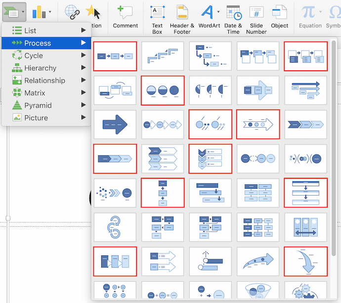
Our Jennasis Pro Tip: Include infographics, flow charts, and boxes to organize your copy. These more visual elements will show your audience that you’ve gone the extra mile in your creative design strategy!
Use visuals to enhance, not distract
Is there anything more distracting than the fly-in text and fade-in photo animations that some presentation programs provide? You may even be guilty of having used images and videos that are too large and don’t provide anything but a visual distraction for your audience.
If you’re going to include photos, videos, or even animations in your presentation, make sure they serve a purpose. You don’t want to cheapen your presentation with silly distractions.
Our Jennasis Pro Tip: Try to include only one image, video, or animation per slide. Make sure that each of these visual elements enhances the message you’re trying to communicate to your audience. Otherwise, don’t include it at all.
Create an interesting flow
It’s time to stop thinking of our presentation slides as numbers. Slide 1, Slide 2—how boring! Try organizing and communicating your presentation so that its messaging flows more like a story. Every story has a beginning, a middle, and an end, so it’s important that this structure is clear to your audience.
If you’re not comfortable writing in a story-like format, you can also break up your presentation into categories—for example, the WHO, the WHY, the WHERE, the WHAT, the WHEN, the HOW.
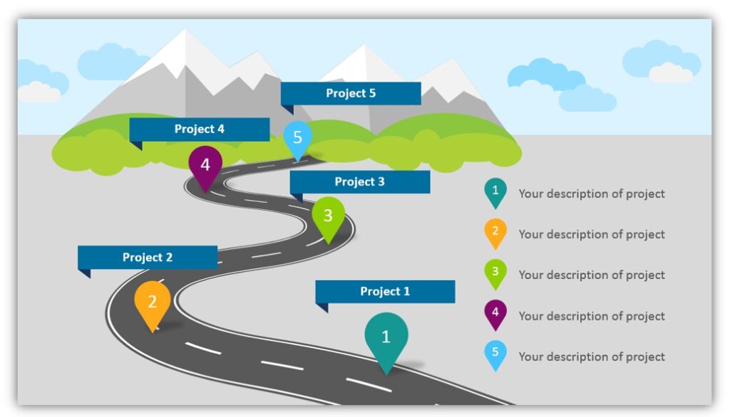
Our Jennasis Pro Tip: Catch the audience’s attention in the beginning, share the most important parts of your presentation in the middle, and end in a way that leaves no uncertainty—only the audience wanting more!
Do you feel more confident in preparing for your next presentation?
The most important thing to remember is that presentations shouldn’t waste anyone’s time. Crush your next presentation by bringing something new to the table in terms of creative design strategy. In the end, you will feel accomplished—and your audience will feel informed, entertained, and confident to partner with you and your organization.
Need more guidance on how to make your next presentation stand out?
The creative graphic design experts at Jennasis & Associates are here to help! With expertise in infographics, presentations, web design, content collateral, and more, our designers will engage with your business objectives to produce graphic design work that is not only creative andeye-catching but also strategically supports your marketing goals. Learn more about our creative graphic design servicesand reach out to let us know how we can help you crush your next presentation!

